UI Designer Resume Keywords: Interface Design, Design Systems & Prototyping
UI designer resume keywords bridge visual craft and systematic design in ATS screening. The terms that pass filtering prove you can design interfaces that are both beautiful and buildable -- not just create pretty mockups that developers cannot implement.
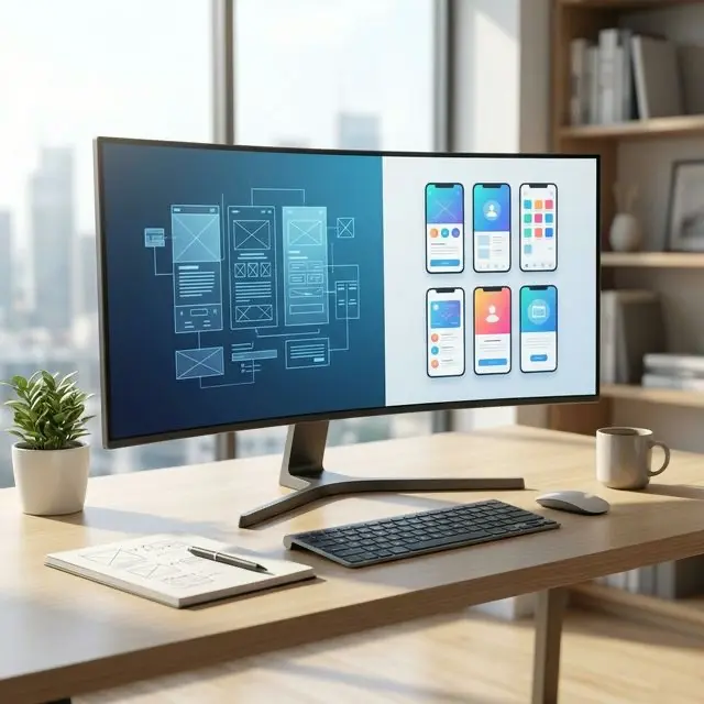
I have worked with UI designers who had stunning portfolios but never got interviews. The pattern was always the same: their resumes described "creating beautiful interfaces" without naming tools, methodologies, or systematic design approaches. ATS systems do not evaluate aesthetics. They match on Figma, design systems, component libraries, and responsive design -- the vocabulary that proves systematic capability.
Find exact formulas for turning interface design work into quantified impact statements in our Professional Impact Dictionary.
Design Tool Keywords
Primary Tools
- Figma
- Sketch
- Adobe XD
- Adobe Photoshop
- Adobe Illustrator
- Framer
- Principle
- ProtoPie
- InVision
- Zeplin
Prototyping
- Prototyping
- Interactive prototypes
- High-fidelity prototypes
- Low-fidelity mockups
- Clickable prototypes
- Prototype testing
- Figma prototyping
- Motion prototyping
- Micro-interaction prototyping
- Flow prototyping
Collaboration & Handoff
- Design handoff
- Developer handoff
- Zeplin
- Figma Dev Mode
- Design specs
- Redlines
- Asset export
- Design documentation
- Annotation
- Design QA
Design Systems Keywords
System Design
- Design systems
- Component libraries
- Design tokens
- Style guide
- Pattern library
- Atomic design
- Component architecture
- Design governance
- System documentation
- Design ops
Components
- UI components
- Reusable components
- Component variants
- State management (design)
- Interactive states
- Hover states
- Error states
- Loading states
- Empty states
- Responsive components
Token Systems
- Design tokens
- Color tokens
- Typography tokens
- Spacing tokens
- Shadow tokens
- Border radius tokens
- Theme support
- Dark mode
- Light mode
- Token documentation
Visual Design Keywords
Typography
- Typography systems
- Type scale
- Font selection
- Type hierarchy
- Web typography
- Variable fonts
- Font pairing
- Readability
- Accessibility typography
Color
- Color systems
- Color palette
- Color accessibility
- Contrast ratios
- WCAG compliance
- Color harmony
- Brand color
- Semantic colors
- Color usage guidelines
Iconography & Illustration
- Iconography
- Icon systems
- Icon design
- Custom icons
- Icon library
- Illustration style
- Spot illustrations
- Decorative elements
- Visual metaphors
Interface Design Keywords
Layout
- Layout design
- Grid systems
- Responsive layouts
- Mobile-first design
- Adaptive design
- Breakpoints
- Fluid layouts
- CSS Grid concepts
- Flexbox concepts
- Spacing systems
Interaction Design
- Interaction design
- Micro-interactions
- Animation design
- Transitions
- Motion design
- Gesture design
- Scroll behavior
- Navigation patterns
- Menu design
- Modal design
Platform Design
- Web design
- Mobile app design
- iOS design
- Android design
- Material Design
- Human Interface Guidelines
- Cross-platform design
- Desktop application design
- Responsive web design
- Progressive web apps
Accessibility Keywords
Standards
- Accessibility
- WCAG 2.1
- WCAG compliance
- Section 508
- ADA compliance
- Inclusive design
- Universal design
- Accessible design
- A11y
Implementation
- Color contrast
- Screen reader compatibility
- Keyboard navigation
- Focus indicators
- Alt text
- ARIA labels
- Touch targets
- Accessible forms
- Semantic HTML awareness
Process Keywords
Design Process
- Design thinking
- User-centered design
- Iterative design
- Design critique
- Design reviews
- Stakeholder presentations
- Design rationale
- Visual exploration
- Concept development
- Design sprint participation
Collaboration
- Cross-functional collaboration
- Engineering partnership
- Product team collaboration
- Design-development workflow
- Agile design
- Sprint planning
- Design estimation
- Peer review
- Design mentoring
Action Verbs for UI Designers
For Design
- Designed
- Created
- Crafted
- Developed
- Built
- Established
- Defined
- Standardized
For Systems
- Systematized
- Documented
- Scaled
- Maintained
- Governed
- Unified
- Consolidated
- Architected
For Impact
- Improved
- Increased
- Reduced
- Elevated
- Modernized
- Transformed
- Streamlined
- Accelerated
Keywords by Experience Level
Junior UI Designer (0-2 years)
- Figma
- Component design
- Visual design
- Responsive layouts
- Design implementation
- Style guide adherence
- Asset creation
- Design QA
Mid-Level UI Designer (3-5 years)
- Design systems
- Component libraries
- Interaction design
- Prototyping
- Developer handoff
- Design critique
- Cross-platform design
- Accessibility
Senior UI / Design Lead (6+ years)
- Design system architecture
- Design ops
- Design governance
- Creative direction
- Design team mentoring
- Design strategy
- Multi-product design
- Design standards
Quick Reference: Top 40 UI Designer Keywords
- UI design
- Figma
- Design systems
- Component libraries
- Visual design
- Responsive design
- Prototyping
- Typography
- Color theory
- Interaction design
- Mobile-first
- Accessibility
- WCAG
- Design tokens
- Sketch
- Adobe XD
- Developer handoff
- Zeplin
- Grid systems
- Micro-interactions
- Motion design
- Icon design
- Design critique
- User-centered design
- Cross-platform
- iOS design
- Android design
- Material Design
- Dark mode
- Style guide
- Pattern library
- Atomic design
- High-fidelity mockups
- Design documentation
- Agile design
- Design QA
- Pixel-perfect
- Layout design
- Brand consistency
- Design ops
Frequently Asked Questions
Should I list both Figma and Sketch on my resume?
List every tool you genuinely know. Figma dominates the market in 2026, but Sketch remains at some companies. Listing both shows adaptability. If you only know Figma, that is sufficient for most roles -- but never list tools you have not actually used.
How do I show design system impact on my resume?
Quantify the system: number of components built, teams adopting the system, consistency improvements (fewer one-off designs), and development speed gains. "Built design system with 120 components adopted by 4 product teams, reducing design-to-development handoff time by 40%" proves systematic impact.
What keywords differentiate UI from visual design roles?
UI design emphasizes interactive interfaces: states, interactions, responsive behavior, design systems, and developer handoff. Visual design emphasizes static outputs: branding, marketing materials, illustration, and print. UI keywords include component libraries, interaction design, and prototyping. Visual design keywords include brand identity, typography, and layout.
Should UI designers include UX research keywords?
Include UX keywords only if you genuinely participate in research. Listing "user research" or "usability testing" when you only design interfaces creates a mismatch that surfaces in interviews. If you collaborate with UX researchers, frame it as partnership: "Designed solutions based on user research insights" rather than claiming research ownership.
Keyword Strategy
Emphasize Systems Over Screens
The strongest UI designer resumes prove systematic thinking, not just screen design. Design systems, component libraries, design tokens, and design governance keywords signal maturity. Companies hiring UI designers in 2026 want people who build scalable design infrastructure, not just individual screens.
Weak: "Designed user interfaces for web and mobile applications"
Strong: "Built and maintained design system with 150 components and design token architecture, adopted across 5 product teams, reducing design inconsistencies by 60% and accelerating feature design from 2 weeks to 3 days"
Include Accessibility as a Core Skill
Accessibility is no longer optional. WCAG compliance, color contrast, screen reader compatibility, and inclusive design are keywords that appear in the majority of UI design job descriptions. Including accessibility keywords signals professional maturity and legal awareness.
Keyword Combinations That Work
Individual keywords show capability. Combinations that include scale, outcome, or context show seniority. These six phrases consistently perform across UI design job applications:
- "Figma design system with 150 components, design tokens, and dark mode support adopted by 5 product teams" — names the tool, quantifies the system, shows organizational impact
- "WCAG 2.1 AA compliance across responsive web and mobile iOS app, verified through automated and manual accessibility audits" — pairs the standard with the platforms and the verification method
- "High-fidelity prototyping in Figma with interactive states, transitions, and developer handoff documentation reducing implementation questions by 60%" — connects prototyping depth to a development efficiency outcome
- "Mobile-first responsive design across iOS and Android platforms following Human Interface Guidelines and Material Design standards" — platform breadth with framework specificity
- "Component library architecture with atomic design methodology, reducing per-screen design time from 2 days to 4 hours" — systematic vocabulary paired with a time-savings metric
- "Cross-functional design collaboration with engineering and product teams in Agile sprints, delivering design specs 1 week ahead of development cycle" — shows process integration, not just design in isolation
UI designer resumes that emphasize systems and measurable efficiency consistently outperform resumes that only describe visual output.