Design & UX Metrics: User Impact Over Aesthetics

Introduction
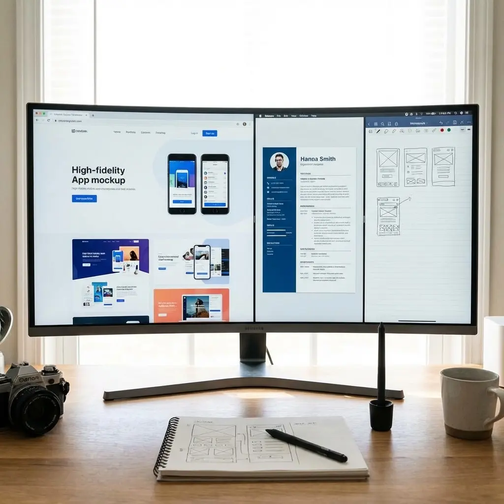
"Made it prettier." That's what most design resumes say, hidden behind "created user-friendly interfaces" or "improved visual design."
It tells me nothing.
Aesthetics are input, not output. What I care about is what that design achieved: Did it increase conversions? Improve task completion? Reduce user errors? Did it make the product more usable or the business more profitable?
Design impact isn't measured in portfolio screenshots. It's measured in conversion rates, usability gains, engagement metrics, and business outcomes.
In this article, I'll show you how to prove design value using metrics that hiring managers actually evaluate: conversion lift, usability improvements, A/B test wins, and engagement increases. For the complete methodology, see our Professional Impact Dictionary.
[!NOTE]
This is ONE lens. Not the whole picture.
User outcome metrics prove design impact, but they're not the only signal. Design thinking, creative process, collaboration approach, and visual craft matter too. Use outcome metrics where they're strongest: showing measurable user and business results.
What This Proves (And What It Does NOT)
Design metrics answer one question: Did this design improve user behavior or business outcomes?
What Design Metrics Prove
- Conversion improvements: You increased signup, purchase, or engagement rates
- Usability gains: You made tasks easier, faster, or less error-prone
- Engagement increases: You improved time spent, feature adoption, or return rates
- Business impact: You contributed to revenue, retention, or cost reduction
What Design Metrics Do NOT Prove
- Visual quality: High conversion doesn't mean beautiful design (sometimes ugly wins)
- Design innovation: Metrics don't show creativity or novel design approaches
- Accessibility: Not all accessibility improvements show up in conversion data immediately
- Long-term brand value: Immediate metrics don't capture brand perception or trust building
Design metrics are a user outcomes lens, not a complete evaluation. Use them to prove measurable impact, but pair them with visual portfolio work, design process examples, and strategic thinking.
Three Categories of Design/UX Metrics
1. Conversion Metrics (Business Outcomes)
Conversion metrics show how your design improved key business actions: signups, purchases, upgrades, or feature adoption. When design decisions require financial justification or ROI analysis, these conversion metrics often feed into broader decision-impact models—for analytical frameworks on proving decision value, see our Finance & Analytics Metrics guide.
What Counts:
- Completion rates: Signup flow, checkout process, onboarding steps
- Conversion lift: A/B test wins showing percentage improvements
- Feature adoption: Users activating or using new capabilities
Formula:
Conversion Lift % = ((New Conversion Rate - Old Conversion Rate) / Old Conversion Rate) × 100%
Business Impact = Conversion Lift × Traffic × Value Per Conversion
Example Bullets:
2. Usability Metrics (User Experience)
Usability metrics show how your design made tasks easier, faster, or less frustrating for users.
What Counts:
- Task success rates: Percentage of users completing target actions
- Time-on-task: How quickly users complete workflows
- Error rates: Form submission failures, navigation confusion, feature misuse
- User satisfaction: SUS scores, NPS, qualitative feedback
Formula:
Usability Improvement = ((New Success Rate - Old Success Rate) / Old Success Rate) × 100%
Error Reduction = ((Old Error Rate - New Error Rate) / Old Error Rate) × 100%
Example Bullets:
3. Engagement Metrics (Product Stickiness)
Engagement metrics show how your design increased user interaction, session quality, or return behavior.
What Counts:
- Session duration: Time users spend in product or feature
- Feature usage: Adoption and frequency of key capabilities
- Return rates: Daily/weekly active usage, retention improvements
- Interaction depth: Pages per session, actions taken, content explored
Formula:
Engagement Lift = ((New Metric - Old Metric) / Old Metric) × 100%
Example Bullets:
Common Misuse of Design Metrics
Design metrics are powerful, but easy to misuse. Here are the most common traps:
1. Vanity Metrics (Engagement Without Value)
Better framing:
2. Missing Context (Numbers Without Meaning)
Better framing:
3. Attribution Errors (Claiming Full Credit)
Better framing:
4. Causation Confusion (Correlation ≠ Causation)
Better framing:
When Design Metrics Matter Most
Not every design decision needs metrics. Exploratory work, brand identity, and creative experimentation often can't be quantified immediately—and that's okay.
Use design metrics when you need to prove specific types of impact: conversion improvements from UX changes, usability gains from interface redesigns, or engagement increases from feature enhancements. These situations benefit from data-driven validation.
Skip metrics when they'd slow down necessary creative exploration or when qualitative feedback provides stronger signal. Early-stage design, brand work, and accessibility improvements often show value through user feedback before appearing in conversion data.
How to Calculate Design Impact (Step-by-Step)
Let's walk through a real example: redesigning a checkout flow.
Scenario
You're a Product Designer. You redesigned the checkout flow to reduce friction and increase completion rates.
Step 1: Identify the User Outcome
This is a conversion metric (checkout completion).
Step 2: Measure Before and After
- Baseline completion rate: 62%
- Redesigned completion rate: 78%
- Improvement: (78 - 62) / 62 = 26% lift
Step 3: Connect to Business Impact
- Monthly checkout attempts: 15,000
- Average order value: $85
- Additional completions: 15,000 × 16% = 2,400 per month
- Revenue impact: 2,400 × $85 = $204k/month or ~$2.4M ARR
(Conservative estimate: Round to $240k ARR to account for variability)
Step 4: Add Context and Methodology
- What you did: Reduced form fields, added progress indicator, improved error messaging
- Validation: A/B test over 4 weeks, statistical significance p < 0.05
- Your role: Solo designer, collaborated with PM and engineering team
Step 5: Frame It As Impact, Not Activity
Step 6: Prepare the Design Defense
In an interview, you'd say:
"The original checkout had 8 form fields and unclear error messages. Users were abandoning at the payment step. I reduced it to 4 required fields, added a progress bar, and redesigned error handling with inline validation. We ran an A/B test for 4 weeks with 15,000 users in each variant. Completion rate went from 62% to 78%—a 26% lift, which translates to about 2,400 additional purchases per month, or roughly $240k in annual revenue."
You just defended the metric with clear design rationale, rigorous testing, and business validation.
Role-Specific Design Metrics Examples
Product Designer
UX Designer
UI Designer
UX Researcher
Brand/Marketing Designer
Frequently Asked Questions
What design metrics should I include on my resume?
Focus on three categories: conversion impact (checkout completion, signup rates, feature adoption), usability improvements (task success rates, time-on-task, error reduction), and engagement metrics (session duration, return rates, feature usage). Choose metrics that show business or user outcomes.
How do I measure conversion lift from design changes?
Use A/B testing to compare old vs. new design. Express as percentage improvement (e.g., "12% increase in signup completion") and absolute impact (e.g., "resulting in 2,400 additional signups per month" or "$150k ARR").
What if I don't have access to conversion data?
Use usability testing results (task success rates, satisfaction scores), qualitative feedback (reduced support tickets, user complaints), or comparative metrics (reduced steps, faster task completion). Be transparent about measurement method.
Should I include aesthetic metrics like Dribbble likes or awards?
Only if relevant to the role. For product/UX roles, prioritize business impact metrics. For brand/marketing design, industry recognition can demonstrate creative excellence. Always pair with outcome metrics.
How do I quantify usability improvements?
Measure task success rates (before/after), time-on-task reductions, error rate decreases, or user satisfaction scores (SUS, NPS). Express as percentage improvements and specify sample size.
Can I use metrics from redesigns led by a team?
Yes, if you specify your contribution. Use "led redesign of X resulting in Y" or "designed Z component that contributed to Y outcome." Don't claim sole credit for collaborative work.
What's the difference between engagement and conversion metrics?
Engagement measures ongoing interaction (session duration, feature usage, return visits). Conversion measures completing a target action (signup, purchase, upgrade). Both are valuable—engagement shows stickiness, conversion shows business outcomes.
Final Thoughts
Design value isn't proven by beautiful portfolios alone. It's proven by user outcomes: higher conversions, better usability, stronger engagement, and measurable business impact.
"Made it look nice" tells me you did the job. User metrics tell me you moved the needle.
The difference between a visual portfolio and a compelling design resume isn't access to analytics data. It's the willingness to measure and communicate design impact.
If you improved conversion, prove it. If you made it more usable, quantify it. If you increased engagement, show the data.
That's design impact. Now demonstrate it.