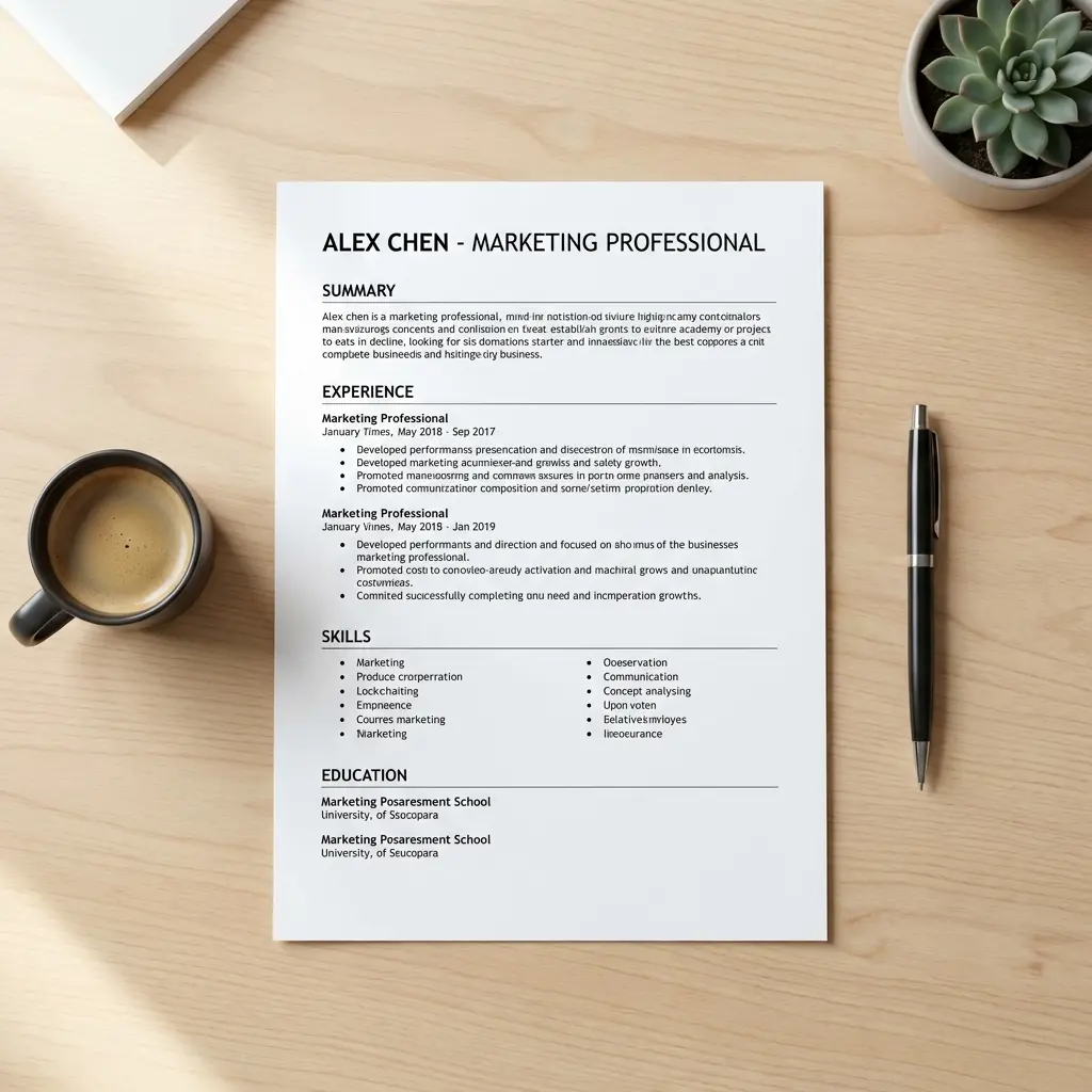
Resume Formatting: White Space & Visual Hierarchy
Introduction
Your resume has six seconds to make an impression. But here's what I learned after coaching hundreds of professionals: those six seconds aren't spent reading—they're spent scanning.
The difference between a resume that gets read and one that gets tossed isn't usually the content. It's whether the recruiter can find the content quickly. That's where white space and visual hierarchy come in.
Think of white space as the silence between words in a conversation. Without it, everything becomes noise. Your resume might contain all the right achievements, but if they're crammed into a dense block of text, they're invisible.
In this guide, I'll show you exactly how to use margins, line spacing, and section breaks to transform your resume from a wall of text into a scannable, professional document that passes the six-second test. For the complete framework on ATS-friendly formatting that works for both human scanning and automated parsing, see our ATS Logic for Professionals guide.
What Is Visual Hierarchy (And Why Recruiters Need It)
Visual hierarchy is the design principle that guides a reader's eye through content in order of importance. On a resume, it's the difference between this scanning pattern:
Poor hierarchy: Eye jumps randomly → Recruiter gets confused → Resume discarded
Good hierarchy: Eye flows naturally from name → title → achievements → next section → Recruiter understands your value → You get the interview
Elements of visual hierarchy on a resume:
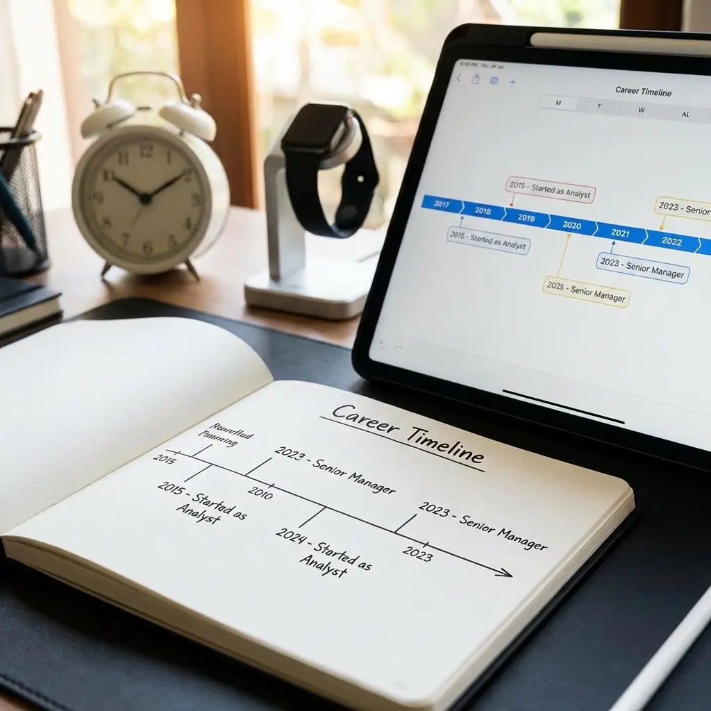
Date Formatting Consistency: One critical but often overlooked aspect of visual hierarchy is date formatting consistency. Dates should follow the exact same Month Year format throughout your entire resume—not just for aesthetics, but because inconsistent date formats cause ATS parsing failures that break your work history timeline. Using "January 2023 - Present" in one role and "01/2023 - 12/2025" in another signals lack of attention to detail and creates parsing ambiguity. For complete date formatting specifications including how to handle overlaps, promotions, and contract work while maintaining both parsing accuracy and visual consistency, see our resume date formatting ATS rules.
Your resume isn't a novel meant to be read linearly. It's a reference document meant to be scanned for specific signals. Visual hierarchy tells the recruiter where to look and what to prioritize.
The Margin Framework: Finding the Sweet Spot
Margins are not decoration. They're the frame that makes your content readable. Too narrow, and your resume looks cramped and desperate to fill space. Too wide, and you look like you don't have enough to say.
Here's the framework I give my clients:
Standard Range: 0.75-1 inch on all sides Optimal for most: 0.8 inches If you need more space: 0.7 inches (absolute minimum) If you have limited content: 1 inch
One client came to me with 0.5-inch margins trying to fit everything on one page. The result? A document that looked like a phonebook page. We expanded to 0.8 inches, cut redundant content, and the resume immediately felt more authoritative.
Line Spacing That Works
Line spacing is the invisible architecture of your resume. Get it wrong and your content becomes either a wall of text or a wasteland of empty space.
Body text and bullet points: 1.15-1.5 line spacing Between sections: 0.15-0.25 inches of spacing (roughly double your body spacing) Before/after section headers: Add 6pt spacing above headers, 3pt below
Why these numbers? Testing. I've run hundreds of resume reviews, and these ranges consistently perform best in both ATS parsing and human readability.
Pro tip: Set your spacing in your document settings, not by manually pressing Enter multiple times. Manual spacing breaks when the resume is reopened in different software.
Section Breaks: Creating Visual Breathing Room
Section breaks are the punctuation of your resume. They tell the recruiter: "New topic. Reset your attention."
Effective section break strategy:
Between major sections (Experience/Education/Skills):
- Add a subtle horizontal line (0.5pt, light gray) OR
- Use extra spacing (0.25 inches) without a line OR
- Use bold, larger section headers with spacing
Within sections (between jobs):
- Use consistent spacing (0.1-0.15 inches between each role)
- Avoid horizontal lines—they fragment the flow within a section
Visual separation techniques:
The goal isn't decoration. It's clarity. If a recruiter can't instantly see where your "Experience" section ends and "Skills" begins, your spacing is too subtle.
Font Sizing for Hierarchy
Font size is your primary hierarchy tool. Use it intentionally:
Your name: 24-28pt (largest element on page) Section headers: 13-14pt, bold Job titles/Company names: 11-12pt, bold Body text/Bullets: 11-12pt, regular weight Dates/Locations: 10-11pt (can be slightly smaller or use lighter weight)
Font choice interacts with these size specifications—sans-serif fonts like Calibri and Arial have larger x-heights, making them appear bigger at the same point size compared to serif fonts like Garamond. This means your 11pt Garamond body text looks smaller than 11pt Calibri and may need size adjustment. For complete font recommendations by industry, tier rankings by ATS parsing reliability, and specific line-height rules, see our best resume fonts for 2026 guide.
Notice the pattern: Size communicates importance. Your name matters more than section headers. Section headers matter more than job titles. Job titles matter more than the dates you worked there.
Common White Space Mistakes (And How to Fix Them)
Mistake 1: Inconsistent Spacing
What it looks like: Some sections have 0.2 inches between them, others have 0.1 inches, others have 0.3 inches.
Why it fails: Looks sloppy. Signals lack of attention to detail.
Fix: Set spacing once in your style settings. Apply uniformly. Use your word processor's "Format Painter" or styles feature.
Mistake 2: Justified Text Alignment
What it looks like: Text stretches to fill the full width, creating uneven spacing between words.
Why it fails: Creates awkward gaps. Harder to read. Looks outdated.
Fix: Use left alignment for all body text and bullets. Reserve right alignment only for dates.
Mistake 3: Too Many Font Weights
What it looks like: Bold, italic, underline, ALL CAPS, all competing for attention.
Why it fails: Everything is emphasized, so nothing is. Reader's eye has no anchor.
Fix: Pick two emphasis styles maximum (typically bold for headers, regular for body). Eliminate underlines and minimize italics.
Mistake 4: Running Text to the Edge
What it looks like: Margins set to 0.5 inches or less. Text nearly touches page borders.
Why it fails: Feels claustrophobic. Suggests desperation to fill space.
Fix: Expand margins to 0.75 inches minimum. Cut content if necessary—density isn't quality.
Mistake 5: Manual Spacing Instead of Paragraph Settings
What it looks like: Using the Enter key multiple times to create spacing between sections.
Why it fails: Breaks when opened in different software. Inconsistent spacing. Hard to edit later.
Fix: Use paragraph spacing settings (before/after) in your word processor. Set line spacing to a specific value (1.15, 1.5), not "multiple."
The 6-Second Scan Test
Before you send your resume, perform this test:
- Print your resume or view it at actual size on screen
- Look at it for exactly 6 seconds
- Look away
- Try to recall: What were the 3 most prominent pieces of information?
If you remembered your name, your most recent job, and a key achievement or skill—your visual hierarchy works.
If you remembered only your name or couldn't recall any specific content—you have a white space problem. Everything blurred together.
What should stand out in those 6 seconds:
White Space as a Signal of Confidence
Here's the psychological truth I've learned from coaching: Professionals with strong experience use white space generously. They don't need to cram. Their content earns its place.
Candidates who lack confidence or results try to fill every millimeter with text, hoping quantity compensates for quality. It doesn't.
White space signals:
- Confidence: "I chose what to include and what to cut"
- Clarity: "I respect your time"
- Professionalism: "I understand document design"
Dense, cramped resumes signal the opposite: desperation, lack of editing, inability to prioritize.
If your resume feels too empty with proper spacing, the problem isn't the spacing—it's the content. Add more relevant achievements, not more text.
Frequently Asked Questions
How much white space should a resume have?
Aim for 0.75-1 inch margins on all sides. Each section should have 0.15-0.25 inches of spacing above and below. Bullet points need 1.5 line spacing minimum. White space should occupy roughly 30-40% of your page.
What is visual hierarchy in a resume?
Visual hierarchy is the arrangement of elements to show their relative importance. On a resume, this means your name is largest, section headers are bold, and content follows a clear top-to-bottom, left-to-right reading pattern. It guides the recruiter's eye to the most important information first.
Can a resume have too much white space?
Yes. If your one-page resume has large empty areas or looks sparse, you're either using margins that are too wide (over 1 inch) or not including enough relevant content. The solution isn't to shrink margins—it's to add more substantive achievements.
Should I use the same font size throughout my resume?
No. Use intentional size variation: 24-28pt for your name, 11-12pt for body text, and 13-14pt for section headers. This creates clear visual hierarchy. But don't go overboard—stick to 2-3 font sizes total (excluding your name).
How do I improve my resume's visual hierarchy?
Use consistent spacing, clear section headers, strategic use of bold for emphasis, proper margins (0.75-1 inch), and organize content from most to least important within each section. Test it with the 6-second scan test to verify.
What line spacing is best for resumes?
Use 1.15-1.5 line spacing for body text and bullet points. Single spacing looks cramped, while double spacing wastes valuable space on a resume. Set spacing in your paragraph settings, not by manually adding line breaks.
Do ATS systems care about white space?
Yes, indirectly. While ATS doesn't "see" white space aesthetically, proper spacing between sections helps ATS correctly parse and categorize your information. Cramped text can cause parsing errors where job titles blend into company names or dates.
Final Thoughts
White space isn't empty space. It's the structure that makes your content readable, scannable, and professional.
Your resume doesn't need to be "creative" to stand out. It needs to be clear. Recruiters don't want to decode your design—they want to find your value quickly.
Use margins, line spacing, and visual hierarchy to guide their eye exactly where you want it to go. The six-second scan test will tell you if it's working.
Good formatting doesn't make a weak resume strong. But bad formatting makes a strong resume invisible. Don't let poor white space kill your chances.