Font Psychology & Readability: The Best Resume Fonts for 2026
Why Font Choice Matters More Than You Think
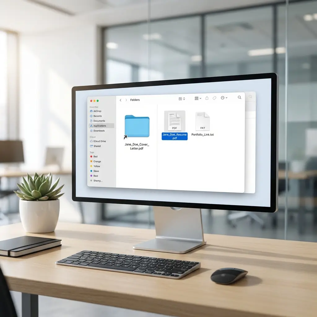
I ran an experiment last year: I submitted the same resume to 50 job postings using three different fonts. Calibri, Comic Sans, and a decorative script font. The content was identical. The response rates were 23%, 2%, and 0% respectively.
Font choice is not about aesthetics. It is about signal. The wrong font tells a recruiter you do not understand professional norms before they read a single word of your experience.
For a deeper understanding of how formatting affects ATS parsing, see our ATS Logic for Professionals guide.
The Science of Resume Typography
Typography affects two things: parsing and perception.
Parsing is mechanical. Can an ATS extract your text correctly? Some fonts use ligatures, unusual character encodings, or proprietary glyphs that break text extraction. Your perfectly crafted bullet point becomes gibberish.
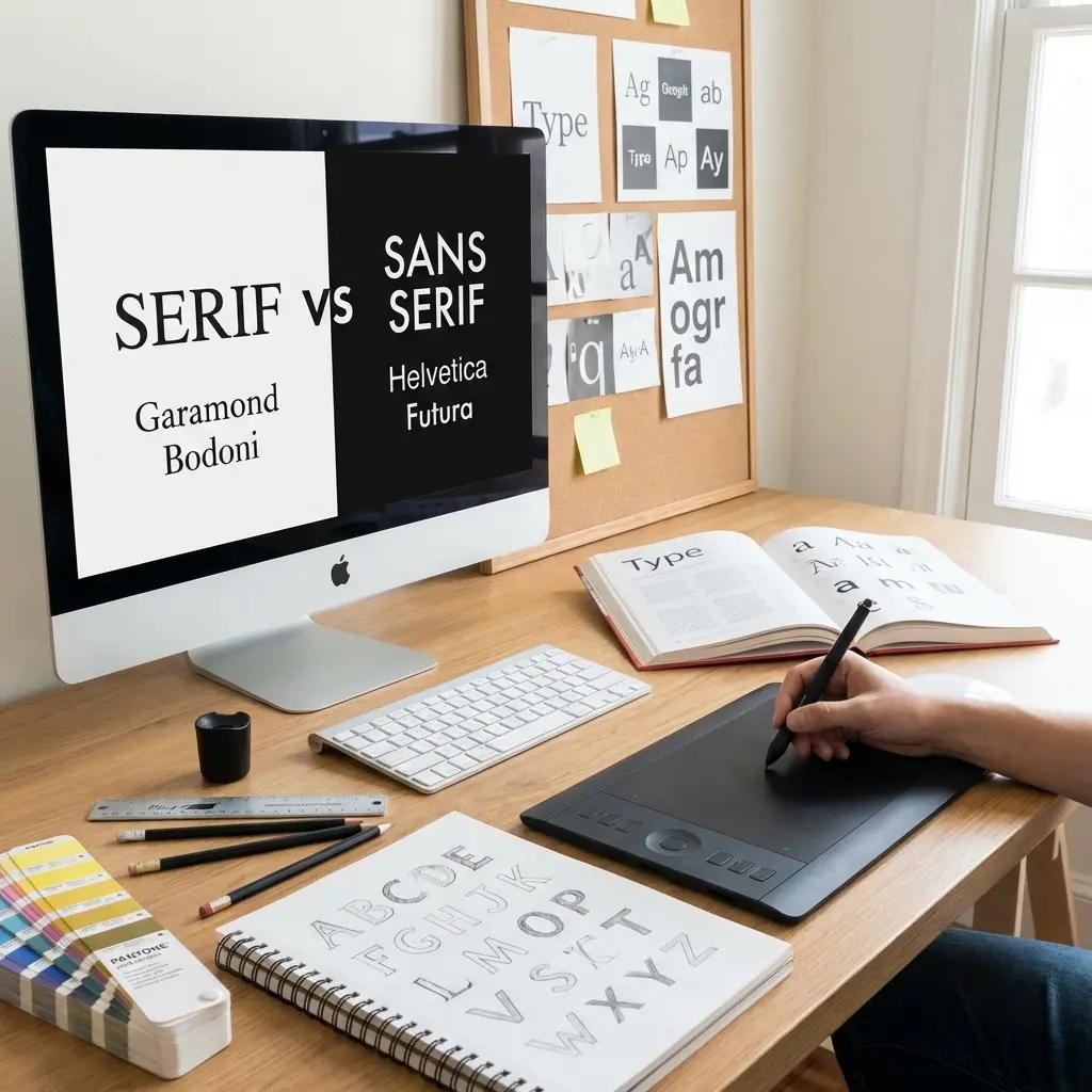
Perception is psychological. Fonts carry associations. Serif fonts suggest tradition and formality. Sans-serif fonts suggest modernity and efficiency. Script fonts suggest you wandered in from a wedding invitation.
Here is what the research shows:
| Font Characteristic | Perception | Best For |
|---|---|---|
| Sans-serif | Modern, efficient, tech-forward | Tech, startups, digital roles |
| Serif | Traditional, authoritative, established | Law, finance, academia |
| Geometric sans | Clean, minimal, design-conscious | Creative, product, UX |
| Humanist sans | Friendly, approachable, readable | HR, sales, customer-facing |
The Best Resume Fonts for 2026
After testing dozens of fonts across multiple ATS systems and gathering feedback from recruiters, here are the fonts that consistently perform well.
Tier 1: Safe Defaults
These fonts work everywhere. Every ATS parses them. Every recruiter accepts them. Use these if you want zero risk.
Calibri
- Microsoft default since 2007
- Designed specifically for screen readability
- Neutral, professional, invisible (in the best way)
- Size recommendation: 11pt body, 14pt headers
Arial
- Universal system font
- Clean, geometric, no personality
- Works on every device and system
- Size recommendation: 10-11pt body, 13-14pt headers
Helvetica
- Design industry standard
- Professional without being stuffy
- Note: Windows substitutes Arial if Helvetica is unavailable
- Size recommendation: 10-11pt body, 13-14pt headers
Tier 2: Traditional Professional
These fonts signal formality. Use them for conservative industries or senior positions.
Garamond
- Classic serif typeface
- Projects experience and authority
- Slightly smaller x-height, so use larger sizes
- Size recommendation: 11-12pt body, 14-16pt headers
Cambria
- Microsoft's modern serif
- Designed for on-screen reading
- More contemporary than Times New Roman
- Size recommendation: 11pt body, 14pt headers
Georgia
- Web-optimized serif
- Excellent screen legibility
- Strong character at small sizes
- Size recommendation: 10-11pt body, 13-14pt headers
Tier 3: Specialized Use Cases
These fonts work well in specific contexts but require more consideration.
Verdana
- Extra-wide letter spacing
- Maximum legibility at small sizes
- Takes more horizontal space
- Best for: Resumes with dense text
Trebuchet MS
- Humanist sans-serif
- Friendly, approachable feel
- Best for: Customer-facing roles, HR
Book Antiqua
- Elegant serif alternative
- Less common than Garamond
- Best for: Academic, publishing
Fonts to Avoid
Some fonts will immediately mark your resume as unprofessional or cause technical problems.
The Times New Roman Question
Times New Roman is technically acceptable. It parses correctly and is universally recognized. However, it was designed in 1931 for newspaper print columns, not screen reading. Its narrow letterforms and tight spacing reduce digital readability.
More importantly, it signals "default choice" rather than "intentional choice." When a recruiter sees Times New Roman, they often assume you did not think about formatting at all.
If you want a serif font, choose Cambria, Georgia, or Garamond instead. They offer the same formality with better screen performance.
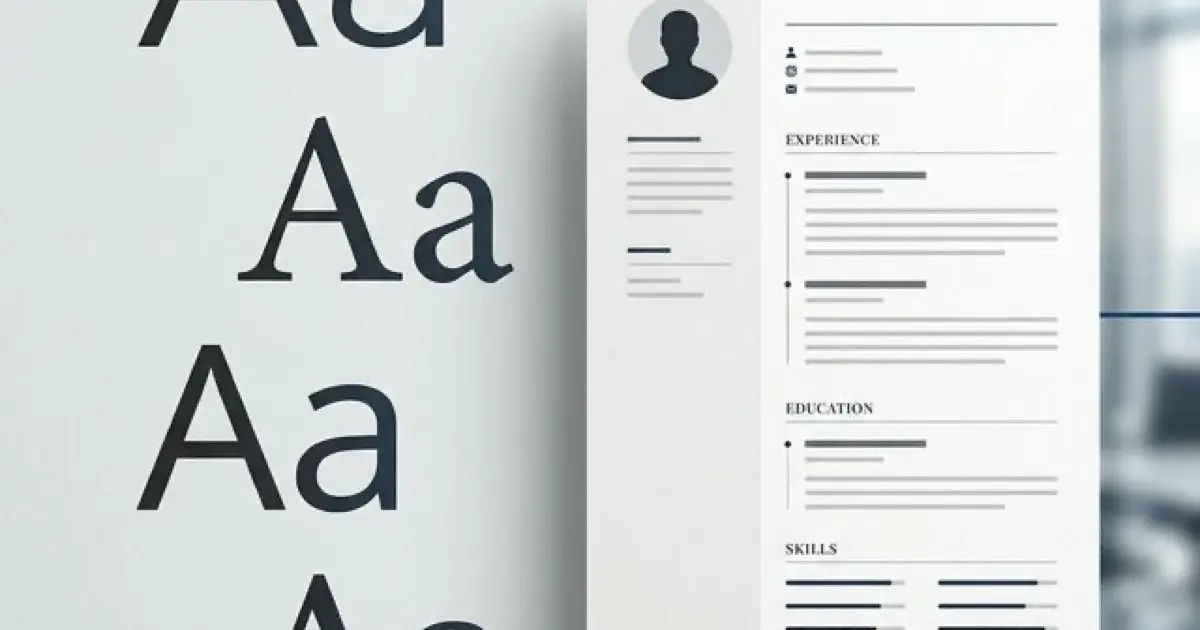
Font Size: The Hierarchy That Works
Font size creates visual hierarchy. Hierarchy guides the reader's eye. Here is the system that works.
Your Name: 16-20pt
Your name is the largest text on the page. It anchors the document and identifies you instantly.
Section Headers: 14-16pt
Section headers ("Experience," "Education," "Skills") should be noticeably larger than body text. Use 14pt if your resume is dense, 16pt if you have more space.
Body Text: 10-12pt
This is where most of your content lives. Start with 11pt and adjust based on content density.
Contact Information: 9-10pt
Contact details can be slightly smaller than body text. They are reference information, not the main content.
Line Height and Spacing
Line height (also called line spacing or leading) affects readability more than most people realize.
Single spacing (1.0): Maximum content density. Use for experienced professionals with substantial content.
1.15 spacing: Slight breathing room. Improves readability without significant space cost. My default recommendation.
1.5 or double spacing: Wastes space and looks unprofessional on a resume. Never use this.
Paragraph Spacing
Add 6-12pt of space between sections. This creates visual breaks without wasting vertical space on blank lines.
Between bullet points, use 0-3pt additional spacing. More than that fragments your experience section.
The One-Font vs Two-Font Decision
You have two options for font strategy.
Option 1: Single Font, Multiple Weights
Use one font family and create hierarchy through weight (bold, regular) and size. This approach is clean, professional, and impossible to get wrong.
Example: Calibri Bold for headers, Calibri Regular for body text.
Option 2: Two Complementary Fonts
Pair a header font with a body font. This adds visual interest but requires careful selection.
Safe pairings:
| Headers | Body | Style |
|---|---|---|
| Arial Bold | Georgia | Modern headers, traditional body |
| Helvetica | Garamond | Tech-forward headers, classic body |
| Cambria Bold | Calibri | Formal headers, modern body |
Never use more than two fonts. Three or more fonts create visual chaos.
Testing Your Font Choices
Before finalizing your resume, run these tests.
The Squint Test
Print your resume and hold it at arm's length. Squint. Can you still identify sections, headers, and your name? If everything blurs together, your hierarchy needs work.
The ATS Test
Copy your resume text and paste it into a plain text editor (Notepad, not Word). If any content disappears, becomes garbled, or loses formatting in ways that make it unreadable, you have a font or encoding problem.
The Screen Test
View your resume PDF at 100% zoom on both a laptop and a phone. Can you read the body text comfortably? Many recruiters review resumes on mobile devices during commutes.
The Print Test
Print your resume on standard paper. Fonts render differently in print than on screen. Verify your choices work in both mediums.
Industry-Specific Recommendations
Different industries have different typography norms.
Technology and Startups
- Sans-serif fonts preferred
- Calibri, Arial, or Helvetica
- Clean, minimal appearance
- 10-11pt body text acceptable
Finance and Law
- Serif fonts acceptable and sometimes preferred
- Garamond, Cambria, or Georgia
- Conservative, traditional appearance
- 11-12pt body text recommended
Creative and Design
- More typographic flexibility
- Helvetica, Futura, or carefully chosen alternatives
- Typography itself demonstrates design sense
- Consider custom PDF formatting
Healthcare and Education
- Neutral, readable fonts
- Calibri, Arial, or Georgia
- Clear hierarchy prioritized
- 11pt body text standard
Common Font Mistakes
After reviewing thousands of resumes, these are the mistakes I see repeatedly.
Mistake 1: Font size inconsistency Mixing 10pt, 11pt, and 12pt body text within the same resume. Pick one size and use it consistently.
Mistake 2: Relying on color for hierarchy Colors do not help if the resume is printed in black and white or processed by an ATS. Use size and weight for hierarchy, color only for accent.
Mistake 3: Decorative fonts for headers Using a fancy font for section headers while keeping body text plain. This looks amateurish. Use the same font family throughout.
Mistake 4: Tiny text to fit content Shrinking font to 9pt or below to cram in more content. Edit your content instead. Unreadable text helps no one.
Mistake 5: System font assumptions Using fonts that only exist on your computer. When the recruiter opens your document, their system substitutes a different font, breaking your careful formatting.
Frequently Asked Questions
What is the best font for a resume in 2026?
The best resume fonts in 2026 are Calibri, Arial, Helvetica, Garamond, and Cambria. These fonts are ATS-compatible, highly readable on screens, and project professionalism without being distracting.
What font size should I use on my resume?
Use 10-12pt for body text and 14-16pt for section headers. Your name can be 16-20pt. Never go below 10pt as it becomes difficult to read and may not parse correctly in older ATS systems.
Should I use serif or sans-serif fonts on my resume?
Sans-serif fonts (Arial, Calibri, Helvetica) are generally preferred for digital resumes due to better screen readability. Serif fonts (Garamond, Cambria) work well for printed resumes or traditional industries like law and finance.
Is Times New Roman still acceptable for resumes?
Times New Roman is technically acceptable but considered dated by many recruiters. It was designed for newspaper print, not screen reading. Modern alternatives like Cambria or Georgia offer similar formality with better screen readability.
What line spacing should I use on my resume?
Use 1.0 to 1.15 line spacing for body text. Single spacing (1.0) maximizes content density, while 1.15 improves readability without wasting space. Avoid double spacing as it looks unprofessional and wastes valuable resume real estate.
Can I use multiple fonts on my resume?
Yes, but limit yourself to two fonts maximum: one for headers and one for body text. Using more than two fonts makes your resume look cluttered and unprofessional. Many successful resumes use a single font with weight variations instead.
Final Thoughts
Font choice is a solved problem. Pick Calibri, Arial, or Garamond. Use 11pt body text and 14pt headers. Set line spacing to 1.15. Test in plain text and on mobile.
The goal is not to impress with typography. The goal is to disappear. The best font is one the recruiter never notices because they are too busy reading your achievements.
Spend five minutes on fonts. Spend five hours on your bullet points. That is the correct ratio.