Resume White Space and Margins: The Formatting Guide

Resume White Space and Margins: What Recruiters Actually See
I review 200+ resumes per week. Here is what happens in the first two seconds: my eyes either find a clear entry point and start scanning, or they hit a wall of text and move to the next candidate. The difference is almost never about content quality. It is about white space.
Resume white space and margins are the invisible architecture that determines whether your content gets read. Get them wrong, and even exceptional achievements disappear into visual noise. Get them right, and average content becomes scannable, digestible, and professional.
Most formatting advice tells you to pick nice margins and move on. That is incomplete. White space is a system with specific rules for margins, section spacing, line height, and content density. These rules interact with ATS parsing, recruiter scanning patterns, and device rendering. Our ATS Logic for Professionals guide covers how formatting decisions affect the entire parsing pipeline—this article focuses specifically on the white space variables you need to control.
The Margin Safe Zone
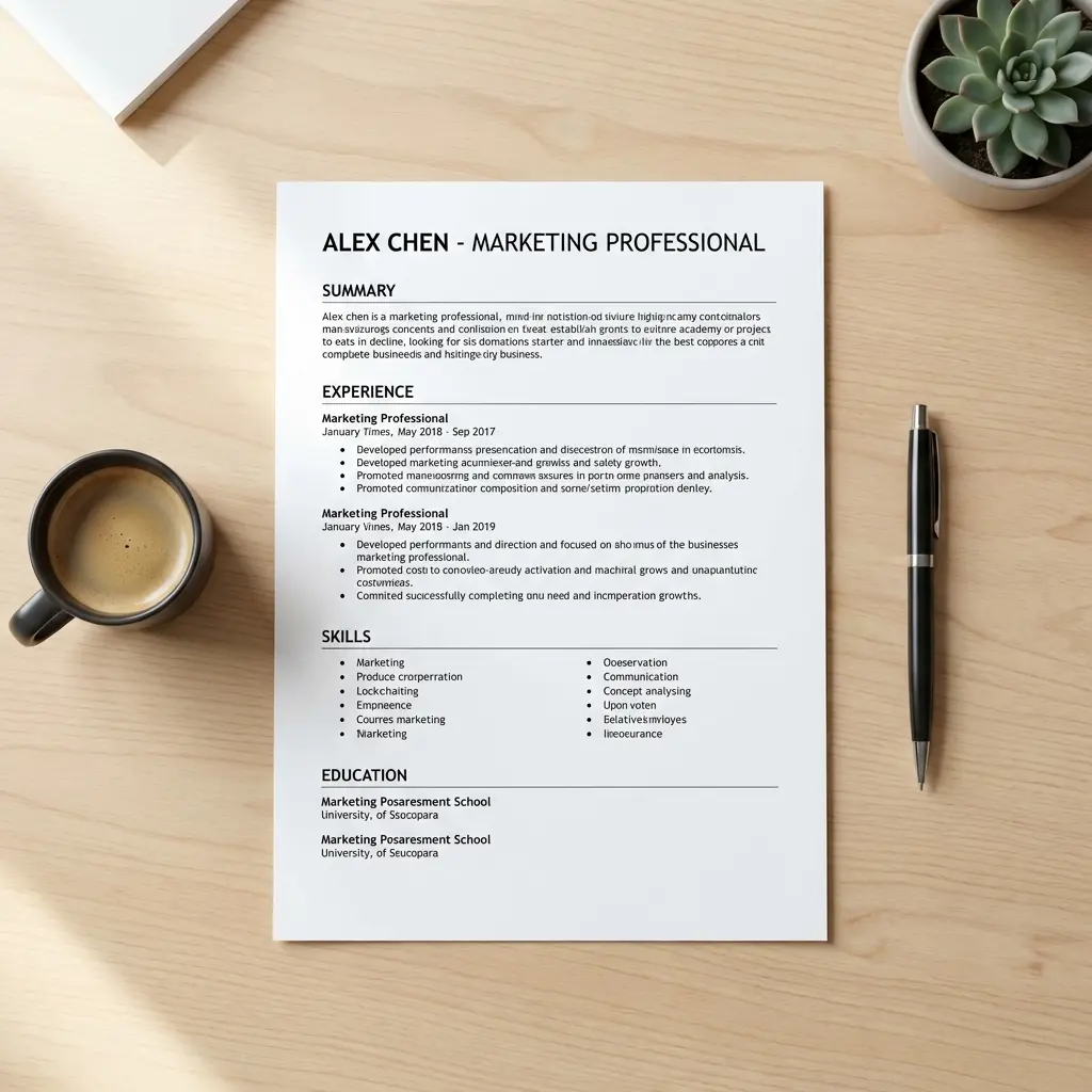
Every resume margin decision comes down to one range: 0.5 to 1.0 inches on all sides.
Why 0.5 Inches Is the Floor
Below 0.5-inch margins, two problems emerge:
ATS clipping. When ATS platforms extract text from PDFs, they assume content lives within standard margin zones. Text that extends to the edge of the page may be clipped during extraction, causing missing words, broken bullet points, or truncated section headers. I have seen resumes where the first 2-3 characters of every line were missing because the left margin was set to 0.25 inches.
Recruiter perception. Cramped margins signal desperation—that you had too much content and squeezed margins rather than editing. This is the resume equivalent of speaking faster instead of saying less. Recruiters interpret tight margins as poor judgment, not thorough experience.
Why 1.0 Inches Is the Ceiling
Above 1-inch margins, the opposite problem occurs: too much empty space around the edges signals you lack content to fill the page. A resume with 1.25-inch margins and sparse content looks like a term paper from someone who did not do the reading.
The Recommended Settings
| Margin | Minimum | Recommended | Maximum |
|---|---|---|---|
| Top | 0.5 in | 0.75 in | 1.0 in |
| Bottom | 0.5 in | 0.5 in | 1.0 in |
| Left | 0.5 in | 0.75 in | 1.0 in |
| Right | 0.5 in | 0.75 in | 1.0 in |
Default to 0.75 inches on all sides. This gives you approximately 7 inches of horizontal content space and 9 inches of vertical space on a standard letter-size page—enough room for substantial content without feeling cramped.
Adjust within the range based on your specific situation. Content-heavy resumes with 10+ years of experience can tighten to 0.5 inches. Shorter resumes for early-career professionals should stay at 0.75-1.0 inches.
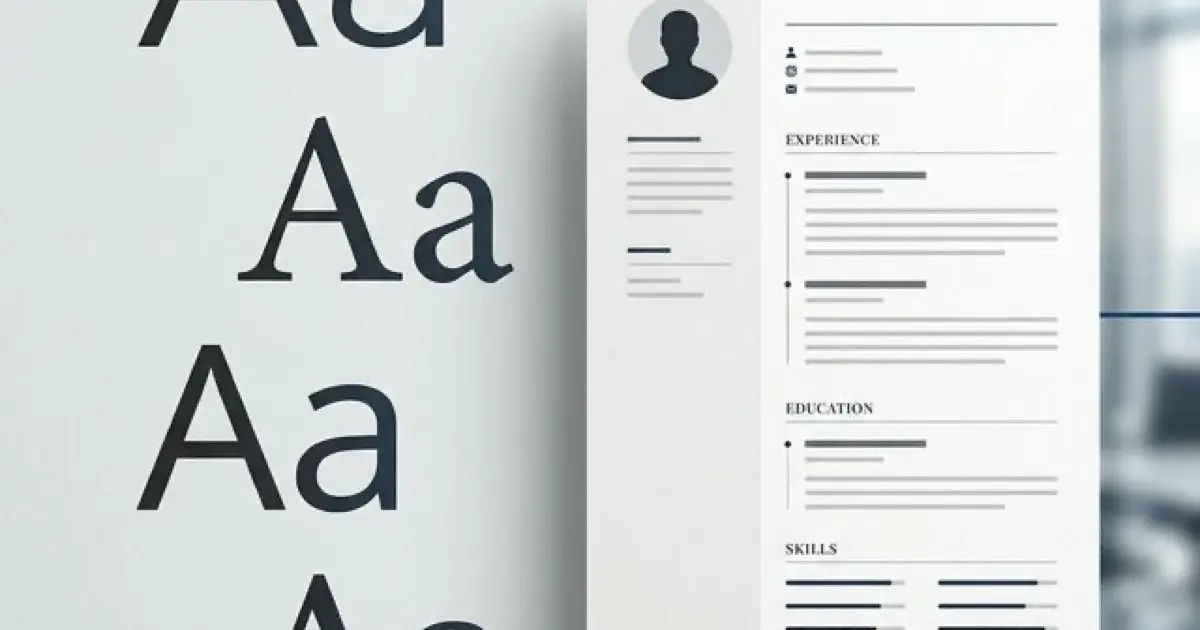
Section Spacing: The Invisible Organizer
Margins handle the edges. Section spacing handles everything between them. This is where most resumes fail—not because margins are wrong, but because sections blur into each other.
The Spacing Hierarchy
Your resume needs three levels of spacing:
Level 1: Section breaks (10-12 points). The gap between major sections (Experience, Education, Skills) should be the largest internal spacing on the page. This creates clear visual boundaries that let recruiters jump between sections during scanning.
Level 2: Entry breaks (6-8 points). The gap between individual entries within a section (between Job A and Job B under Experience) should be smaller than section breaks but clearly visible. This separates roles while keeping them visually grouped.
Level 3: Bullet spacing (2-4 points). The gap between bullet points within a single entry. Tight enough to keep bullets visually connected to their role, loose enough to read individually.
Why This Hierarchy Matters
When all spacing is uniform, the resume becomes a flat wall. Recruiters cannot tell where one section ends and another begins without reading every line. The spacing hierarchy creates a visual map that enables the 6-second scan: name → current role → key sections → specific bullets.
Without hierarchy, scanning fails. With hierarchy, scanning is effortless.
Common Spacing Mistakes
Mistake 1: Zero space between sections. Sections run directly into each other with no visual break. The recruiter must read section headers carefully to navigate—which they will not do.
Mistake 2: Excessive space between sections. Gaps of 20+ points between sections waste space and make the resume feel disconnected, as if it was assembled from separate documents.
Mistake 3: Inconsistent spacing. Different gaps between different sections (12 points after Experience but 6 points after Education). Inconsistency looks careless and breaks the visual rhythm.
Line Spacing: The Density Controller
Line spacing (leading) controls how dense your text blocks appear. It is the difference between text that feels readable and text that feels suffocating.
The Rules
Body text: 1.0 to 1.15 line spacing. Single spacing (1.0) is acceptable for content-dense resumes where every line contains high-value information. The 1.15 setting adds just enough breathing room to improve readability without wasting space. Never use double spacing (2.0)—this is a resume, not a manuscript.
Bullet points: 1.0 line spacing with 2-4 points after. Keep the text within each bullet tight, then add a small gap between bullets. This groups the text within each bullet while separating bullets from each other.
Section headers: 1.0 line spacing. Headers are typically single lines, so line spacing within them rarely matters. What matters is the space before and after headers (see section spacing above).
The Density Sweet Spot
Your goal is approximately 40-50% white space across the entire page. This includes margins, section gaps, line spacing, and bullet spacing combined.
Below 30% white space: wall of text. Recruiters skip. Above 60% white space: looks empty. Recruiters question your experience. At 40-50%: comfortable scanning density. Content feels substantial but accessible.
The squint test: Hold your resume at arm's length and squint. You should see distinct blocks of text separated by clear channels of white space. If you see a single dark rectangle, you need more spacing. If you see mostly white with scattered text, you need more content or tighter spacing.
Content Density: When to Edit, Not Resize
Here is where most candidates make the critical error: they have too much content for one page, so they shrink margins, reduce font size, and tighten spacing until everything fits. This is backwards.
The Editing Hierarchy
When your resume does not fit, follow this order:
Step 1: Cut weak bullets. Every role should have 3-5 achievement bullets. If you have 7-8, the weakest 2-3 are diluting your strongest ones. Removing weak bullets improves both density and quality.
Step 2: Merge similar achievements. Two bullets that prove the same skill can often become one stronger bullet. "Managed a team of 8" and "Led weekly team standups" combine into "Led an 8-person team through weekly sprint planning, delivering 94% of quarterly objectives."
Step 3: Cut the weakest section. If you have a Skills, Certifications, Awards, and Volunteer section, one of those is weaker than the others. Remove it entirely. Four strong sections beat five sections where one is padding.
Step 4: Only then adjust spacing. After editing, if you still need a small amount of space, tighten margins from 0.75 to 0.5 inches or reduce section spacing from 12 to 10 points. Never drop font below 10 points.
ATS and White Space: What Actually Matters
ATS systems do not evaluate white space aesthetically. They extract text and ignore visual formatting. But your white space decisions still affect ATS performance in three ways:
Margin Clipping
As discussed above, margins below 0.5 inches risk text extraction failures. The ATS reads the PDF's text layer, not the visual layout, but narrow margins can cause text to overlap with page boundaries in ways that confuse extraction algorithms.
Section Recognition
Many ATS platforms use spatial analysis to identify section boundaries. Consistent spacing between sections helps the parser correctly group content under the right headers. Inconsistent spacing can cause the ATS to merge two sections or split one section into fragments.
Column Detection
Two-column resume layouts create white space in the center gutter. Some ATS platforms misread this as a single column and interleave text from left and right columns, creating garbled output. If you use columns, test your resume through an ATS parser before submitting. Single-column layouts avoid this risk entirely.
The Format Across Devices
Your resume will be viewed on screens ranging from 27-inch monitors to 5-inch phones. White space that looks perfect on a large screen can feel excessive on mobile, and spacing that works on mobile can feel cramped on desktop.
Desktop (Primary Review)
Most initial recruiter reviews happen on desktop monitors or laptops. Your standard margin and spacing settings are optimized for this context. No special adjustments needed.
Mobile (Growing Fast)
Hiring managers increasingly review resumes on phones during commutes or between meetings. PDFs on mobile screens zoom to fit width, which shrinks everything proportionally. Resumes with tight spacing become nearly unreadable on mobile. The 0.75-inch margin default provides enough breathing room to remain readable even at mobile zoom levels.
Print (Still Relevant)
Some hiring processes involve printing resumes for interview panels. Printers have their own margin requirements (typically 0.25-0.5 inches of unprintable area at edges). Resumes with 0.5-inch margins print cleanly. Resumes with smaller margins may lose content at the edges.
Build a professionally formatted resume with optimized spacing and layout
Frequently Asked Questions
What are the best margins for a resume?
Between 0.5 and 1.0 inches on all sides. Default to 0.75 inches. Below 0.5 inches risks ATS clipping and looks cramped. Above 1.0 inches wastes space.
How much white space should a resume have?
Target 40-50% of the total page area. Use the squint test: at arm's length, you should see distinct text blocks separated by clear white channels.
What line spacing should I use?
Body text at 1.0-1.15 line spacing. Add 2-4 points between bullet points, 6-8 points between entries, and 10-12 points between sections.
Do margins affect ATS parsing?
Yes. Margins below 0.5 inches can cause text clipping during PDF extraction. Stay within 0.5-1.0 inches for clean parsing across all major ATS platforms.
Should margins be the same on all sides?
Symmetric margins are safest. Slight asymmetry (0.75 left, 0.5 right) is acceptable. Avoid dramatically different margins on different sides.
How do I fix a crowded resume?
Edit content first: cut weak bullets, merge similar achievements, remove the weakest section. Only then adjust spacing. Never shrink margins below 0.5 inches or font below 10 points.
Final Thoughts
White space is not empty space. It is the structure that makes your content accessible. Every margin, every section gap, every line of spacing serves a purpose: guiding the recruiter's eye from your name to your strongest achievements in six seconds or less.
Stop treating formatting as an afterthought. Set your margins at 0.75 inches, establish your spacing hierarchy, verify the density balance, and then focus on what actually matters—the achievements those margins frame. The best white space is the kind nobody notices because it is doing its job perfectly.