Best ATS-Friendly Fonts for Your Resume in 2026
Introduction
I've seen resumes written in Comic Sans. I've seen them in Papyrus. I've even seen one written in a font that looked like Lord of the Rings handwriting.
Do you know where those resumes went? The trash.
As a recruiter, I stare at documents all day. The font you choose sends a subliminal message before I even read a word. Before you continue, make sure to optimize your resume for ATS systems to set a strong foundation for your application.
- Times New Roman: "I haven't updated this since college."
- Arial: "I'm safe, practical, and functional."
- Comic Sans: "I am not a serious candidate."
But beyond my personal annoyance, there is a technical problem. Applicant Tracking Systems (ATS). Some fancy, downloaded fonts get garbled when parsed. If the robot can't read your font, it can't read your skills.
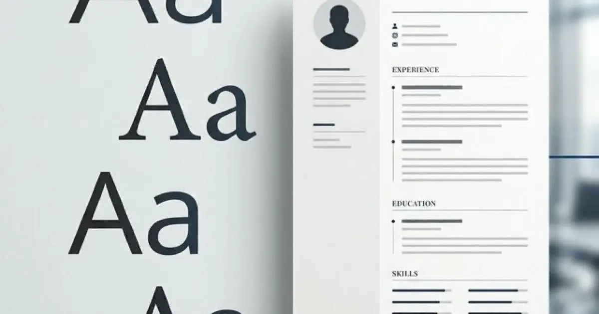
Font selection matters most in your header—the prime real estate that both ATS and recruiters scan first. Your name needs to be 18-24pt in a clean, readable font that parses correctly. Using decorative fonts in your header creates immediate parsing failures because ATS systems struggle to extract your name and contact information from non-standard typefaces. For complete header specifications including which contact elements to include, optimal font sizes, and layout that works for both ATS and human scanning, see our resume header contact info best practices.
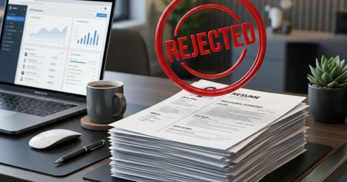
I've seen resumes with beautiful custom fonts in the header—the candidate's name was rendered in some elegant script typeface. The problem? ATS parsed it as "J∂hn D∫∑" instead of "John Doe". The entire application was automatically rejected because the system couldn't extract the candidate's name.
Here is the definitive guide to fonts that safeguard your text's integrity and keep your recruiter's eyes happy. Fonts are just one component of ATS parsing—section headers, bullet styles, and date formats all follow specific technical rules. For the complete parsing specification including exactly which formats ATS systems recognize, see our ATS-friendly formatting guide.
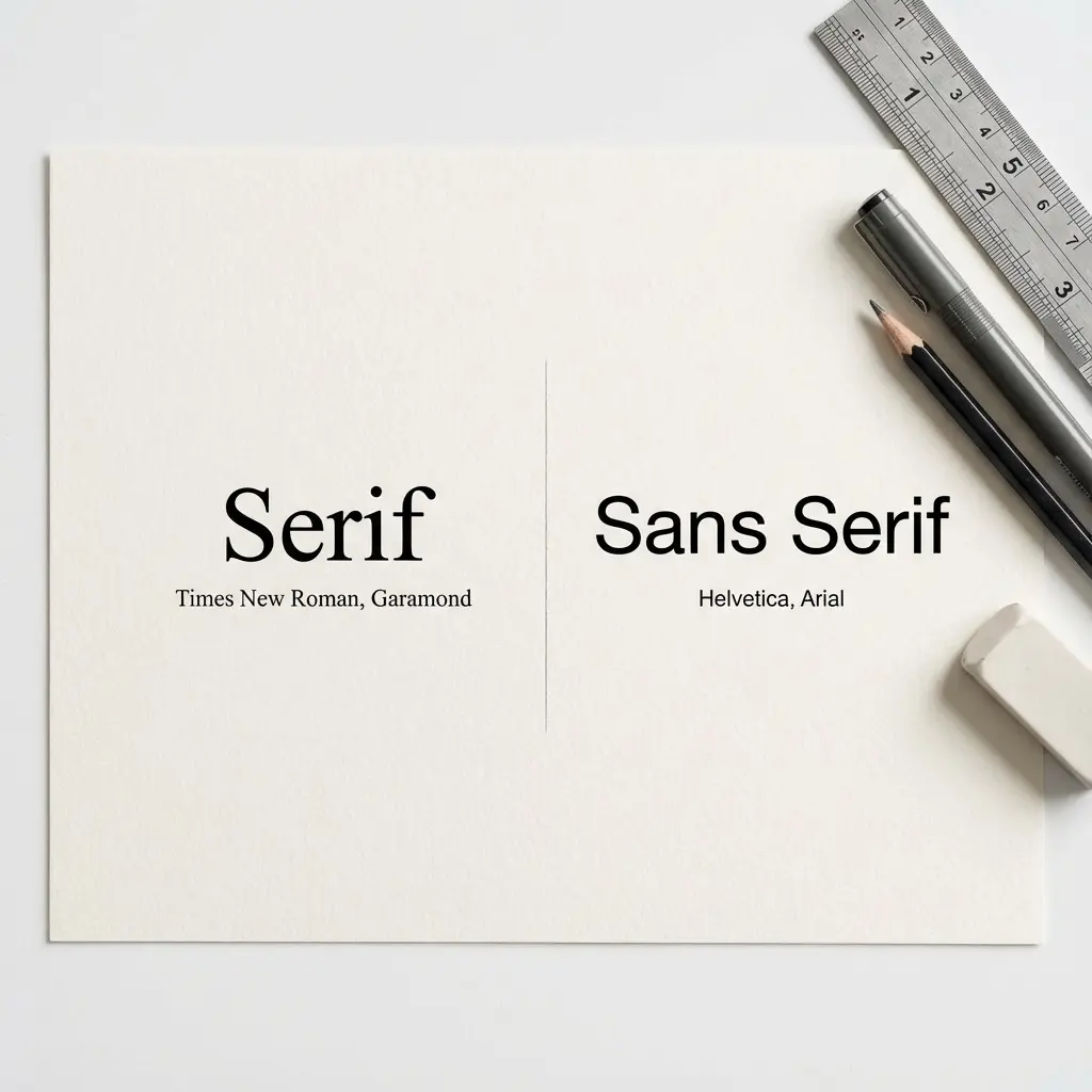
The Two Families: Serif vs. Sans-Serif
First, a quick typography lesson.
- Serif: Fonts with little "feet" at the ends of letters (e.g., Times New Roman). They feel traditional, authoritative, academic.
- Sans-Serif: Fonts without feet (e.g., Arial). They feel modern, clean, digital.
My Verdict: Go Sans-Serif. Why? Because 100% of resume screening happens on screens now. Sans-serif fonts are generally easier to read on low-resolution monitors and mobile devices.
To understand why this matters for algorithms, read our AI resume screening guide.
Top 5 San-Serif Fonts (The Modern Choice)
These are the safest, cleanest options for 2026.
1. Calibri
The default for a reason. It's soft, round, and incredibly readable. It packs a lot of text into a small space without feeling cramped.
- Vibe: Professional, friendly, modern standard.
2. Arial
The safest font on earth. Every computer has it. Every ATS can read it. It's a bit boring, but it's immune to failure.
- Vibe: Neutral, safe, utilitarian.
3. Helvetica
The designer's favorite. It's sleek and professional. Note: PC users often don't have true Helvetica installed (they have Arial), but Mac users love it.
- Vibe: Crisp, high-end, efficient.
4. Roboto
The font of Android and Google. It's becoming a new standard. It feels tech-forward and geometric.
- Vibe: Techy, engineered, open.
5. Verdana
Designed specifically for screen reading. It has wide letter spacing.
- Pro: Very easy to read at small sizes.
- Con: It takes up a LOT of space. Only use if you're struggling to fill the page.
Top 3 Serif Fonts (The Traditional Choice)
If you are applying to a law firm, academia, or a very conservative industry, a Serif font adds gravitas. But please, ditch Times New Roman.
1. Georgia
Designed for screens. It's slightly wider and more readable than Times. It looks beautiful and authoritative.
- Vibe: Traditional but not dusty.
2. Garamond
The classic book font. It is elegant and thinner than Georgia. It creates a very sophisticated look.
- Vibe: Literary, executive, refined.
3. Cambria
The Serif cousin to Calibri. It's sturdy and clear.
- Vibe: Reliable, crisp, academic.
Why Times New Roman Failed
You might be asking, "Why do you hate Times New Roman so much? It's a classic!"
It's not just me. Times New Roman was designed for newspapers in 1931. It was designed to be narrow to save ink and paper space. On a high-resolution screen, it looks spindly and dated.
When a recruiter opens a resume in Times New Roman, it subliminally signals "Default Settings." It suggests you didn't put thought into the presentation; you just opened Word and started typing. In a competitive market, you want to signal "Modern," "Clean," and "Intentional."
Mac vs. PC Font Rendering
Here is a technical nightmare scenario: You write your resume on a Mac using Helvetica Neue. It looks stunning. You send it to a recruiter.
The recruiter opens it on a Windows 10 PC that doesn't have Helvetica Neue installed. Word attempts to substitute the font, usually with Arial or Calibri.
Suddenly, your perfect one-page resume spills onto two pages. Your headers are misaligned. Your bullet points look weird.
The Fix:
- Always save as PDF. This embeds the font into the document so it looks the same on every device.
- Stick to "Web Safe" fonts. Arial, Calibri, Georgia, and Verdana are safe on almost every machine in existence.
The Role of White Space
Font isn't just about the letters; it's about the space between them.
- Line Height (Leading): Do not squash your lines together to fit the page. A line height of 1.15 or 1.2 is ideal. 1.0 looks like a wall of text.
- Margins: Standard is 1 inch. You can cheat down to 0.75 inches, but anything smaller and the text looks like it's falling off the page.
Good use of white space makes any font look expensive. Bad white space makes even Garamond look cheap.
The Psychology of Typography
Fonts have personalities. We judge them instantly.
- Thin, light fonts: Can feel elegant but hard to read. They might suggest "Design" but lack "Authority."
- Heavy, bold fonts: Feel strong and assertive, but too much use makes them feel aggressive (like shouting).
- Monospace fonts (Courier): Feel technical, like code. Great for a few lines of code snippets, terrible for body text.
Your goal is Cognitive Ease. You want the recruiter's brain to process the information with zero friction. A familiar, clean font like Calibri reduces cognitive load. A weird, fancy font increases it.
Font Pairing: How to Mix Fonts Correctly
If you feel confident, you can pair a Header font with a different Body font.
The Rules of Pairing:
- Contrast is key: Don't pair Arial with Helvetica (they are too similar). Pair a Serif Header with a Sans-Serif Body.
- The Classic Combo: Garamond for Headers (elegant) + Arial for Body (readable).
- The Modern Combo: Roboto Bold for Headers + Roboto Light for Body.
Safe Bet: Just use Calibri for everything. Use Bold for headers and all-caps if you want contrast.
Accessibility Matters: Dyslexia and Fonts
Did you know that about 10-15% of the population has dyslexia? That might include your hiring manager.
Typography accessibility is a real consideration. "Busy" fonts with poor separation between letters (kerning) can be physically hard to read.
- Good for Dyslexia: Arial, Verdana, Calibri, Century Gothic. These have clear, distinct letter shapes.
- Bad for Dyslexia: Times New Roman, Italics generally, and condensed fonts.
By choosing a clean, open font like Verdana, you are making your resume accessible to everyone.
Fonts to AVOID at All Costs
Technical Tips for Font Formatting
1. Size Matters
- Body Text: 10pt is the absolute minimum (and only for some fonts). 11pt is ideal. 12pt is luxurious.
- Headers: 14pt to 16pt. Big enough to scan, not comically large.
2. Don't Mix Too Much
Stick to one font family. You can use Bold for headers and Italics for job titles, but don't use Arial for headers and Garamond for body text unless you truly have a designer's eye. It usually looks messy.
3. The "Copy-Paste" Test
To verify if a font is ATS-friendly:
- Save your resume as PDF.
- Open it.
- Select the text and copy it.
- Paste it into Notepad (or a plain text editor).
Does it look like your resume? Or does it look like P@ssion*te Sal#s M@nager? If it's garbled, the font (or the PDF encoding) is bad. Switch to Arial or Calibri and try again.
Download ATS-Friendly Resume Templates
Final Thoughts
Your font should be invisible. If I notice your font, you've probably made a mistake. I should be noticing your achievements.
The goal of typography on a resume is to get out of the way and let the content shine. Pick Calibri or Arial if you're unsure. Pick Garamond if you want to look fancy. And then stop worrying about it and focus on your bullet points.
That's where the real offer is won.